Hi there, welcome to my little corner of the internet!
I’m a bit of a tech geek, and I absolutely love diving into the latest developments and trends in the industry. With a decade of experience under my belt, I’m honoured to have learnt a thing or two about what it takes to succeed in this fast-paced world.
One of my favorite things about the tech industry is how quickly things can change. It keeps me on my toes and always learning, which is both challenging and exciting. From startups to established companies, I’ve seen firsthand how innovative business models combined with heart and work ethic can transform entire industries.
I feel incredibly blessed to have had the opportunity to invest in and work with some amazing companies and initiatives over the years. It’s truly been a joy to see them grow and succeed, and I’m proud to have played a small part in their journey.
If you’re looking to partner with a tech-savvy, industry-geek, and fun-loving business investor who is committed to making a difference, then look no further. Let’s connect and see what kind of magic we can create together!
P.S. First round of coffees on me~!
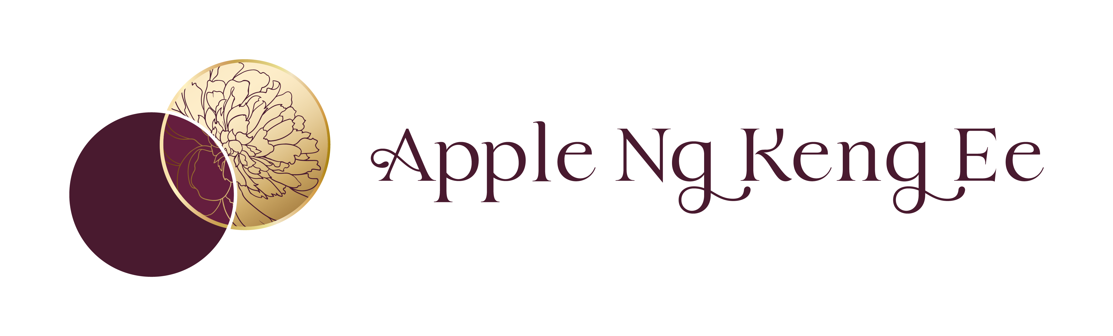
Brand Philosophy
Circles
Circles represent unity and connection. The two circles coming together and intersecting symbolizes the brand’s focus on collaboration and partnership with clients. It also represents the brand’s ability to bring different ideas and elements together to create customized solutions.
Diagonal Placement
The positioning of the top circle to the right suggests a sense of progress and upward movement.
Gold Rim
Symbolizes the high value and quality of the projects taken by the brand. We are excited about helping shine a light on at the intersection where excitement and quality meet.
Peony Motif
Known for their lush, full blooms, Peonies represent the brand’s commitment to providing a variety of thoughtful lasting solutions for their partners. Associated with goodwill, joy, prosperity and good fortune, the imagery aligns with the brand’s aims to bring positive outcomes and successful results to the projects it spearheads. In nature, Peonies have a lifespan of more than 100 years, and have come to signal resilience and longevity to these values.
The combination of Gold Rim and Peony Motif is symbolic of the brand’s commitment to
delivering high-quality, full-blooming and thriving projects.
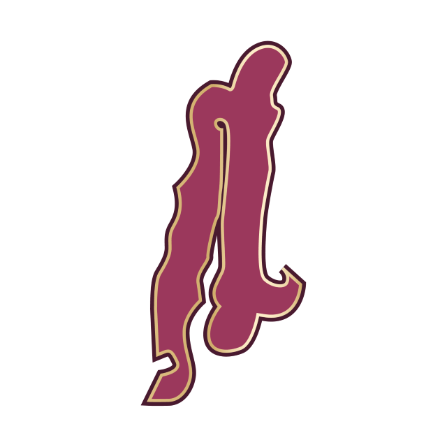
Serif Font + Ligature
A serif font conveys a sense of reliability and trustworthiness. While the ligatures convey sophistication, professionalism, and attention to detail.
Logo Variations:
Colour Palette
Primary:
Deep Plum
Gold Lead
Mulberry
Secondary:
Plum Noir
Magenta Jam
Periwinkle Ash
Kraft Paper
Bone
Visual Language
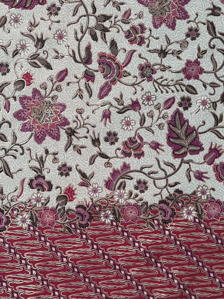
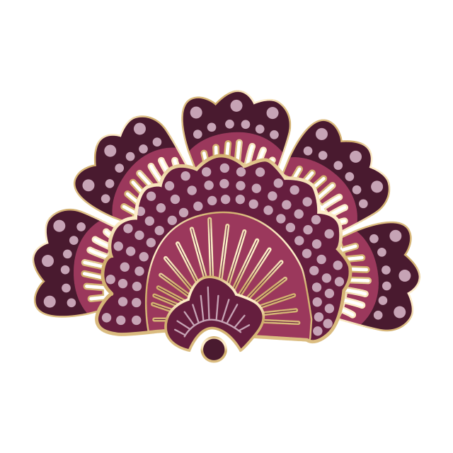
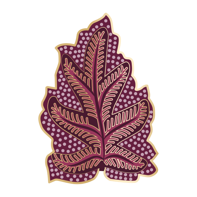
Batik
Batik is a traditional fabric in South East Asia. Incorporating batik into the branding pays homage to the southeast Asian culture and serves as a reminder of the homeland. while creating a unique brand identity. The intricate patterns and and colors of batik symbolize the dynamic nature of the company’s services and convey a sense of authenticity and handcrafted quality.
Additionally, the use of batik can differentiate the company from competitors and create a strong and memorable brand image that can be used across various marketing materials. Overall, incorporating batik into the branding can communicate the company’s values, strengths, and unique offerings.
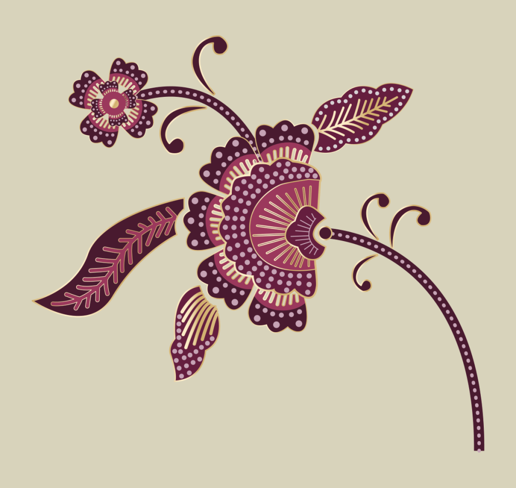
Building Blocks
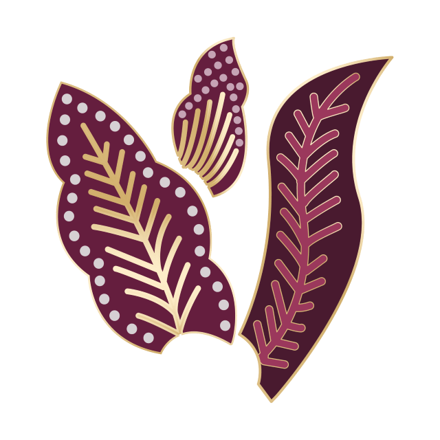
Leaf Motif
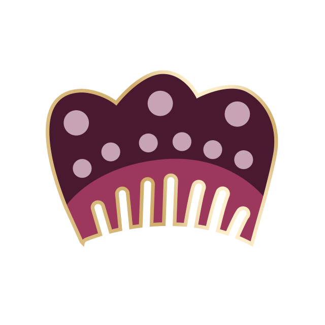
Petal Motif
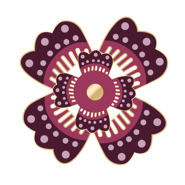
Flower Motif
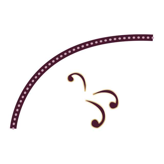
Vines
Peony Motif
Palm Leaf Motif
Parang Wave Motif
Background for Batik